How to Make a Scroll-Stopping LinkedIn Carousel in 2026
How to make a LinkedIn carousel that stops the scroll: pick one idea, structure the slides with a proven framework, design for mobile, and upload it as a PDF.


Your best idea deserves more than one line in the feed.
A text post gets a glance. A LinkedIn carousel gets a swipe, then another, then another, and each swipe is a few more seconds someone spends with your thinking. That is the whole appeal: a carousel is a slow-drip format in a fast-scroll feed. This guide is a complete walkthrough of how to make a LinkedIn carousel that actually earns those swipes, from one idea to a finished PDF you can publish today.
I run CaptureFlow, so I make a lot of these. CaptureFlow is an AI content agent that turns your expertise into weeks of on-brand content for every platform. But you do not need a tool to make a great carousel, you need a structure. Here it is.
First, the definition, because it decides everything downstream.
A LinkedIn carousel is a multi-slide document post (a PDF) that readers swipe through in the feed, one idea per slide. It is not a slideshow you narrate and it is not a dumping ground for a whole essay. It is a sequence, and a sequence only works if each slide does one job and hands off to the next.
Why carousels win on LinkedIn
The feed rewards attention, and carousels are attention machines. They are also just one format in a wider plan, so it helps to see where they fit in a complete LinkedIn content strategy before you sink hours into slide design.
LinkedIn's own engineering team has written about using dwell time to rank the feed: the platform measures how long a post holds you, and treats that time as a signal the content was worth showing. A text post is read in one motion. A carousel asks for a swipe on every slide, and every swipe is more dwell time. You are not gaming the algorithm, you are giving people a reason to stay.
There is a second reason carousels punch above their weight: they are saveable and screenshot-worthy. A good 7-slide framework gets screenshotted, saved, and sent to a colleague, exactly the quiet signals that tell LinkedIn a post has value. A witty one-liner rarely gets saved. A clean visual breakdown does.
Dwell time is the reason carousels feel like they overperform. You are converting one idea into eight small moments of attention instead of one. The format does not make weak ideas strong, but it gives a strong idea far more room to land.
The catch is that all of that only happens if the deck is built right. So let us build one.
How to make a LinkedIn carousel in five steps
The whole build is five steps, none of which need a designer: pick one idea, structure the slides, design for mobile, write the caption, and upload as a PDF.
Step 1: Pick one idea
The most common carousel mistake is trying to say five things at once. A carousel is a sequence, and a sequence needs a single destination.
Before you open a design tool, finish this sentence in one line: "By the last slide, the reader will understand ____." If you cannot fill that blank with one clear idea, you are not ready to design yet. One framework. One process. One myth you are busting. One list. That is the scope of a single carousel.
The good news is that you almost certainly already have the idea. It is in a talk you gave, a question you answered on a call, a point you made in a longer post. This is the same principle behind turning one video into ten LinkedIn posts: the raw material exists, you are just choosing one thread and following it all the way through.
Step 2: Structure the slides
Once you have the idea, the structure is almost mechanical. Every carousel that works has the same three-part anatomy.
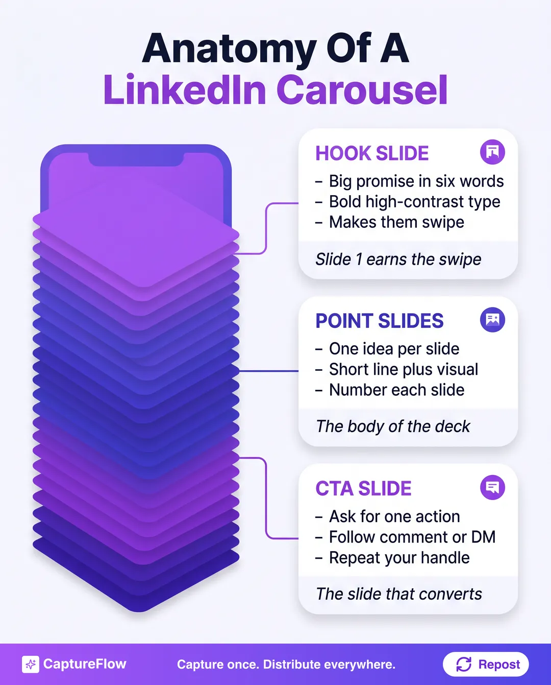 Three parts, one job each. The hook earns the swipe, the point slides deliver, the CTA converts.
- The hook slide. Slide one has one job: make the reader swipe. It carries the biggest, boldest promise in the fewest words. Not a title, a promise. "5 mistakes killing your reach" beats "Thoughts on LinkedIn engagement" every time.
- The point slides. The middle of the deck. Each slide carries exactly one idea, in a short line with room to breathe, and each is numbered so the reader always knows where they are in the sequence. One thought per slide is non-negotiable. The moment a slide holds two ideas, both get skimmed.
- The CTA slide. The last slide asks for one action and only one. Follow for more, drop a comment, or send a DM. Repeat your name or handle here too, because a saved or reshared carousel travels far from your profile.
That hook slide matters so much it is worth its own study. The rules that make a scroll-stopping first line in a text post are the same ones that make a great slide one, so borrow directly from our guide on how to write LinkedIn hooks.
Step 3: Design for mobile
Most people will see your carousel on a phone, held in one hand, thumb ready. Design for that reality or lose it.
If a slide is not readable at a glance on a phone screen, it does not exist. That single rule solves most design questions. It means portrait slides at 1080 by 1350 pixels (a 4:5 ratio), which fill the most vertical space in the mobile feed without cropping. It means type big enough to read without zooming, and high contrast so it survives a bright screen outdoors. And it means one idea per slide, with generous whitespace, because a cramped slide reads as work and people do not swipe toward work.
You do not need a designer. A consistent template, a readable font, your brand color, and a slide number in the corner is enough. Plenty of free LinkedIn carousel templates exist precisely so you can keep the layout consistent and spend your energy on the words. The goal is not a beautiful deck, it is a legible one.
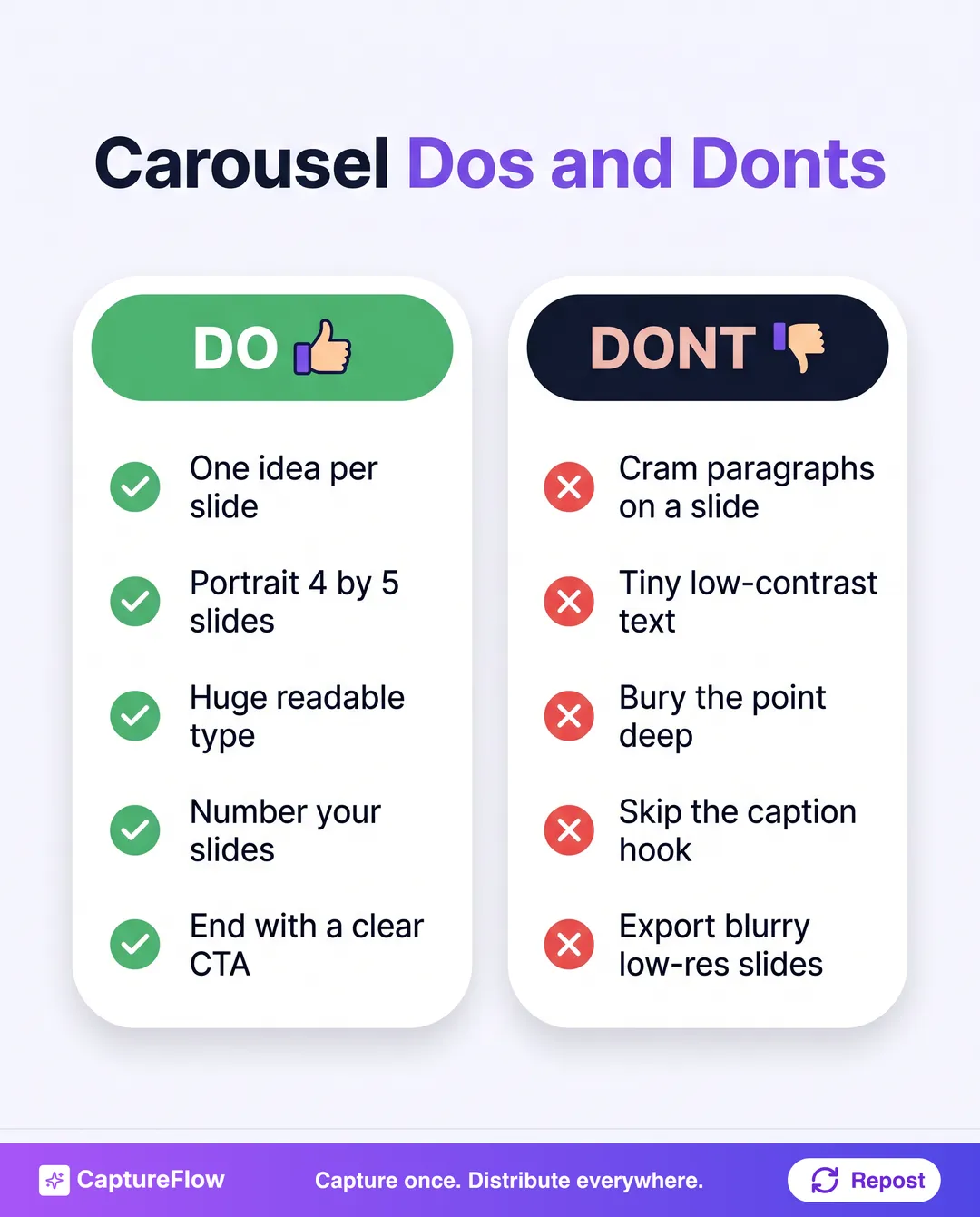 The whole design philosophy in two columns. When in doubt, cut, do not add.
Step 4: Write the caption and hook
Here is what most guides skip: the deck is not the first thing people read. The caption is.
The carousel sits inside a normal post, and that post has a first line the feed shows before "see more". If that line is flat, nobody ever opens the deck you spent an hour designing. So the caption's opening line is a second hook, and it does the same job as your slide one: create enough tension or curiosity that swiping into the carousel feels necessary.
The rule of two hooksThe caption sells the swipe. The slides keep the promise. Skip the first and nobody ever reaches the second.
Keep the caption itself short. One line of tension, one line of context, and a nudge to swipe. Then let the slides carry the argument. If you want the caption to pull its full weight, treat it like a standalone post and apply everything in our guide on how to write a LinkedIn post that gets read to the end.
Step 5: Upload it as a PDF document
The final step is the one that trips people up: how you upload determines whether LinkedIn renders a swipeable carousel at all.
LinkedIn does not have a dedicated "carousel" button for organic posts. It has a document post. Export your slides as a single PDF, with every page the same size, then start a new post and choose the document option ("Add a document"). Upload the PDF, give it a short descriptive title (this shows above the deck and is worth a keyword), write your caption, and publish. LinkedIn turns that PDF into the native swipeable carousel you see in the feed.
A few upload rules keep it clean: PDF gives the sharpest render, keep every page the same dimensions so nothing crops, and export at full resolution so text stays crisp. Blurry slides are the fastest way to lose credibility in the first swipe.
Save a reusable template PDF once. Cover layout, point-slide layout, CTA layout, your color, your handle in the corner. After that, making a new carousel is just swapping the words, and you go from an hour per deck to about 5 minutes.
A 7-slide framework you can reuse
If you want a structure to start from tomorrow, use this one. It fits almost any founder topic and keeps you honest about one idea per slide.
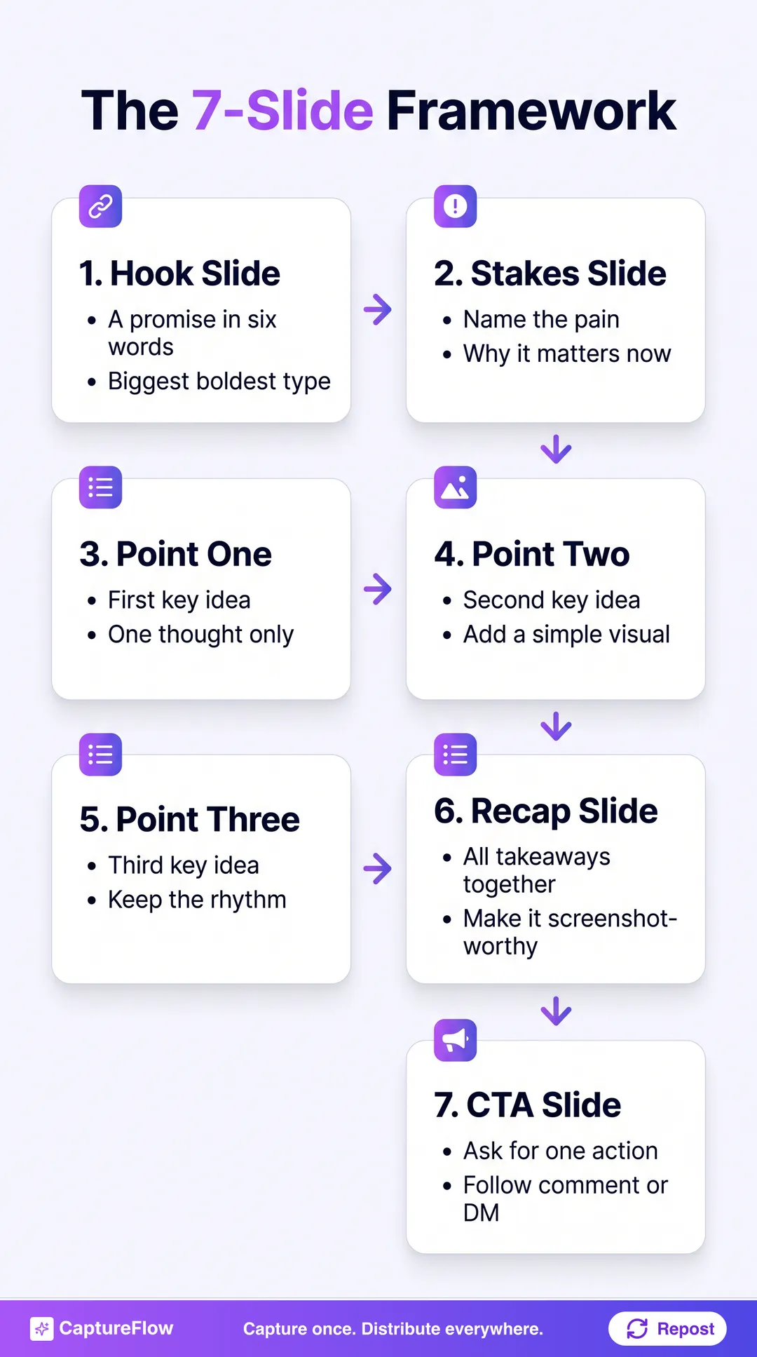 A reusable skeleton. Swap the three points for your idea and the deck writes itself.
- Hook slide. The promise, in the boldest type on the deck.
- Stakes slide. Name the pain and why it matters right now.
- Point one. Your first key idea, one thought only.
- Point two. The second idea, with a simple visual if it helps.
- Point three. The third idea. Keep the rhythm identical to slides three and four.
- Recap slide. All three takeaways on one screen, so it gets screenshotted.
- CTA slide. One ask. Follow, comment, or DM.
Three points is a guideline, not a law. Use two if the idea is simple, five if it is meaty, but keep the hook, recap, and CTA fixed. Those three are the load-bearing walls.
Where a content agent speeds this up
Every step above is doable by hand. The slow part is doing it every week, on top of everything else a founder carries.
That is the gap CaptureFlow closes. You capture one idea, a voice note or a video or a link, and the agent drafts the whole carousel: the hook slide, the point slides in your voice, the recap, and the caption with its own hook. You review, adjust, and publish. The same capture also becomes an X thread, a quote image, and a short video, so one idea does not stop at one format.
Tools that only format your text into slides, like a dedicated LinkedIn writing app such as AuthoredUp, handle the layout well but still need you to bring the words. A content agent brings the words too, drafted from something you already said. That is the difference between a design tool and a content system.
Make your first one this week
You do not need to be a designer to make a carousel that works. You need one idea, three-part structure, mobile-first slides, a caption that hooks, and a PDF upload.
Pick the idea you explain most often, run it through the 7-slide framework, and post it. Then, if making one a week by hand is one job too many, start a free trial and let your content agent draft the next ten from a single capture.
Sources
- LinkedIn Engineering, "Understanding dwell time to improve LinkedIn feed ranking"
Frequently asked questions
What is a LinkedIn carousel?+
A LinkedIn carousel is a multi-slide document post, usually a PDF, that appears in the feed as a swipeable deck. Each slide holds one idea, and readers swipe left to move through the sequence. It is the same mechanic as an Instagram carousel, delivered through LinkedIn's document-post feature.
How many slides should a LinkedIn carousel have?+
Five to ten is the sweet spot. Fewer than five rarely justifies the format, and more than about twelve loses people before the end. A tight 7-slide deck (hook, stakes, three points, recap, CTA) works for almost any topic.
How do you post a carousel on LinkedIn?+
Design your slides, export the deck as a single PDF, then start a LinkedIn post and use the document (or 'Add a document') option to upload the PDF. Give it a short descriptive title, write a caption with a strong first line, and publish.
What size should LinkedIn carousel slides be?+
Portrait 1080 by 1350 pixels (a 4:5 ratio) takes up the most vertical space in the mobile feed without cropping. Keep every slide the same size so the PDF renders cleanly as a carousel.
Chris is the founder and CEO of CaptureFlow, which he builds so founders can turn their expertise into content without hiring a team. After 10+ years building products and growing audiences from scratch, he writes about founder-led content, AI, and distribution from inside the problem he is solving: distributing consistent, on-brand content as a team of one.
Founder & CEO of CaptureFlow · 10+ years building products and audiences
One playbook a week from founders who actually create and distribute lots of content. No spam, unsubscribe anytime.
Keep reading

What Drives LinkedIn Engagement: 2,500 Posts Analyzed
We pulled the public LinkedIn history of 25 founders, 2,500 posts in total, to build our playbook teardowns. The engagement pattern hiding in that data surprised us.

LinkedIn Content Ideas: 50 Posts to Steal When You're Not an Influencer
You are not out of things to say, you are out of shapes to say them in. Here are 50 specific LinkedIn content ideas, organized into 6 buckets, that you can post starting today.

LinkedIn Content Strategy: The Complete 2026 Guide
Most founders post on LinkedIn at random and wonder why nothing compounds. This is the complete LinkedIn content strategy, from positioning to pillars to cadence to tooling.